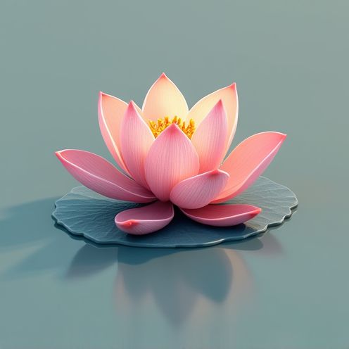
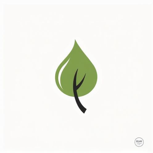
Quietude business logo and graphic design
The Quietude logo design was crafted to embody the essence of tranquility and calm in our bustling world. When it was first conceived, the design scene had a few leading styles, though now, innovative logo concepts are limitless. Regardless of the design approach, the Quietude logo seeks to mirror serene environments and introduce a sense of peace into branding. While at first glance, this logo may appear minimalist and understated, it actually carries a depth of intention and sophistication--currently gaining significant attention. Elevate your brand presence with an exploration of the Quietude logo and consider incorporating its elements into your identity.
The Quietude logo design process emphasized simplicity and harmony to visually embody the brand's essence of tranquility and calmness. Utilizing a minimalist approach, the design palette was dominated by soft, muted colors such as gentle blues and calming greens, paired with smooth, flowing typography that mirrored the serene qualities of the name. As a result, the Quietude logo successfully conveys a sense of peacefulness and balance, effectively representing its core values and appealing to an audience seeking relaxation and mindfulness.


Comments