Popcorn business logo and graphic design
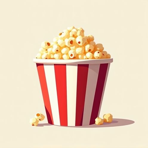
Popcorn logo design emerged as a playful way to capture the essence and whimsy of this beloved snack, especially during the golden age of cinema. In the past, there was one predominant style--reel and retro--but now popcorn logo ideas are as abundant as the varieties you find at the theater. Regardless of its shape, a popcorn logo encapsulates the excitement and fun associated with movie nights and carnival days. While initially, this design might seem solely entertainment-focused, it's surprisingly versatile and engaging, making waves in branding efforts. Elevate your brand with these popcorn logo concepts and make your mark in the world of design.
The creation of a Popcorn logo typically involves a design process that captures the essence and appeal of popcorn while ensuring brand recognition and visual attractiveness. Starting with brainstorming and concept development, designers consider elements such as kernels, popped corn, buttery colors, and playful fonts that evoke nostalgia and fun, associated with movie nights or snacking. The final result is a logo that effectively communicates the product's core attributes and appeals to target audiences, often using stylized illustrations or bold, vibrant designs to make a memorable impact.








Comments