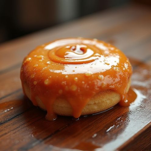
Donuts business logo and graphic design
The art of crafting a Donuts logo is a deliciously creative endeavor that blends whimsy with brand identity. Originally emerging as sweet symbols of indulgence during the rise of donut shops in the 20th century, these logos have come a long way. Today's Donuts logo designs are as varied as the flavors and toppings they represent. Whether it's a minimalist approach with a mere circle or a colorful, playful depiction complete with sprinkles, a well-designed Donuts logo communicates more than just a product--it captures an experience. Despite the potential for sugary cliches, a Donuts logo can be both charming and innovative, perfectly balancing nostalgia with modern appeal. Dive into the world of design possibilities and whip up a logo that's as enticing as the treat itself.
The Donuts logo design process involved a meticulous approach to encapsulating the whimsical and indulgent essence of donuts while establishing a unique brand identity. The logo prominently features vibrant colors often associated with donuts, such as pinks, pastels, and browns, to convey a playful yet appetizing feel. As a result, the final design successfully balances simplicity with boldness, creating an instantly recognizable and inviting logo that effectively communicates the brand's delightful and fun-loving spirit.


Comments