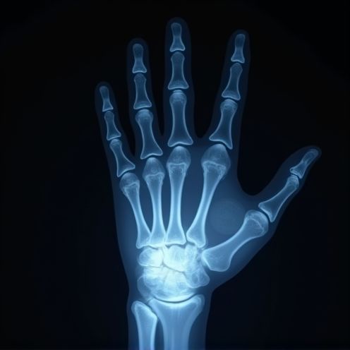
X-ray business logo and graphic design
X-ray logo design emerged as a distinct and innovative trend to add a touch of modernity and intrigue to brand identities. Initially, there was a humble selection of concepts, while now X-ray logo ideas flourish in abundance. Regardless of the approach, X-ray logos capture the essence of transparency and depth, adding an intriguing layer to visual branding. While at first glance, this design style may appear niche or overly technical, it is, in fact, versatile and captivating--and is currently witnessing a significant upswing in popularity. Elevate your branding strategy with the following X-ray logo ideas and craft a distinctive identity of your own.
The design of an X-ray logo involves the creative process of incorporating elements that symbolize the unique characteristics of X-ray technology, usually blending medical or imaging symbols with sleek, modern design aesthetics. Designers often explore the use of monochromatic color palettes, primarily black, white, and shades of gray, to reflect the grayscale nature of X-ray imaging while incorporating abstract shapes or representations of X-ray waves and skeletal structures to make the logo distinctive and recognizable. The result is a logo that effectively conveys the essence of X-ray technology, balancing technical sophistication with visual appeal, often used by medical institutions or imaging equipment manufacturers to reinforce their brand identity within the healthcare industry.


Comments