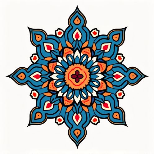
Wellbeing business logo and graphic design
Wellbeing logos emerged as a distinctive symbol during the wellness movement, aiming to visually represent the concept of balanced and healthy living. Initially, there was a singular emphasis on simplistic designs, but now numerous creative interpretations of wellbeing logos exist. Irrespective of the design, these logos encapsulate the essence of tranquility and positivity, adding a visual anchor to wellness branding. While at first glance, a wellbeing logo might seem overly simplistic or cliched, in truth, it is meaningful and engaging--and is currently seeing a significant upswing in popularity. Elevate your brand with the following wellbeing logo inspirations and design one uniquely yours.
Designing a wellbeing logo involves a process that emphasizes simplicity, meaningful symbolism, and soothing color palettes to evoke feelings of health and balance. It typically requires understanding the core values and mission of the entity it represents, ensuring the logo effectively communicates a sense of peace, wholeness, and vitality. The result is a visual identity that not only looks appealing but also resonates with the target audience, promoting a sense of trust and connection in the context of mental and physical wellness.


Comments