Towing business logo and graphic design
Towing logo design came into prominence with the rise of transportation services, offering companies a distinct identity in the bustling industry. Back then, a straightforward approach was often employed, but today the possibilities for towing logo designs are vast and varied. Regardless of style, a towing logo symbolizes reliability and trust, serving as a visual anchor for clientele. While some might initially regard this niche design as purely functional, it actually presents an exciting and creative opportunity--and is currently experiencing a noteworthy evolution. Elevate your brand with the following towing logo design concepts and craft one uniquely yours.
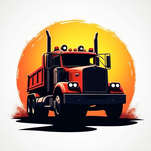
Designing a towing logo involves a multi-step process that ensures the final logo effectively communicates the business's identity and services. Initially, designers conduct thorough research to understand the towing industry, target audience, and competitors, which informs the brainstorming and concept development phase. The process typically culminates in creating a distinctive logo that incorporates elements like strong typography, relevant imagery such as tow trucks or hooks, and a color palette that conveys professionalism and reliability, resulting in a compelling visual representation that resonates with potential clients and sets the business apart.










Comments