Storage business logo and graphic design
Storage logo design has evolved significantly to meet the demands of modern businesses seeking unique branding solutions. Initially, storage logos were straightforward and focused solely on utility. However, as the market has grown, so too have the creative approaches to these logos. Today, storage logo design incorporates elements that emphasize security, reliability, and innovation. Instead of the conventional box or warehouse imagery, designers now explore a plethora of ideas that combine sleek lines and vibrant colors with clever symbolism. This fresh take on storage logos not only enhances brand recognition but also adds a touch of sophistication and modernity to the storage industry. Elevate your business identity with the following storage logo design ideas and develop a striking emblem that stands out.
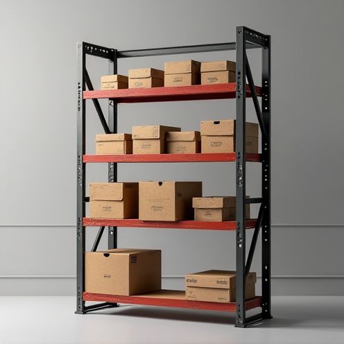
The design of a storage logo typically involves symbols that convey organization, security, and reliability, often incorporating imagery like boxes, locks, or stylized containers to visually represent the concept of storage. During the design process, attention is paid to the choice of colors and typography to ensure they align with the brand's identity and resonate with the target audience, creating an image that is both recognizable and trustworthy. As a result, a well-designed storage logo effectively communicates the company's core services and values, helping to distinguish the brand in a competitive market and build a strong rapport with customers.


Comments