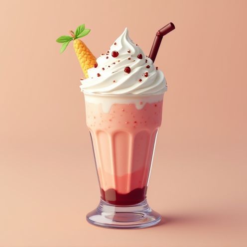
Icecream business logo and graphic design
Ice cream logo design has evolved from simple graphics to intricate creations, aiming to capture both the essence of the brand and the joy of indulging in a sweet treat. During the early days, there was a tendency towards minimalist designs, while today's ice cream logos come in a vast array of styles. Regardless of approach, a well-crafted ice cream logo embodies the spirit of fun and delight, enhancing brand recognition. While initially one might associate such designs with childishness or frivolity, they actually convey warmth and excitement--qualities that resonate strongly with consumers. Refresh your brand identity with the ice cream logo inspirations and design a standout symbol for your product.
The creation of an ice cream logo typically involves a detailed process of conceptualization and design to visually capture the essence and appeal of the ice cream brand. Initially, designers brainstorm various symbols, colors, and fonts that evoke the senses associated with ice cream, such as freshness, sweetness, and fun. The resulting logo usually features playful and appetizing elements like pastel colors, imagery of ice cream cones or scoops, and stylized lettering, effectively conveying the delightful experience of enjoying ice cream and enhancing brand recognition and attraction in a competitive market.


Comments