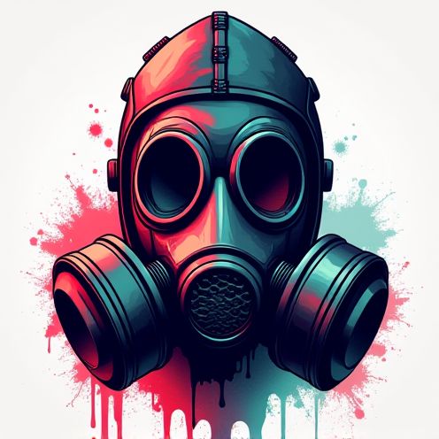
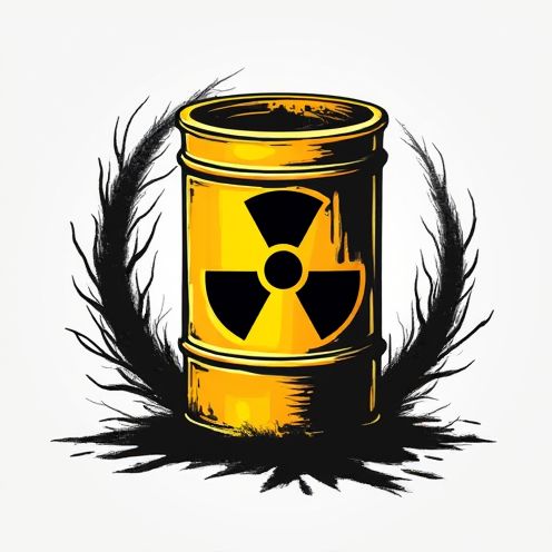
Hazardous business logo and graphic design
Hazardous logo design first emerged as a critical need during the industrial boom, where clear, stark visual communication was essential to ensure safety in rapidly growing environments. Back then, simplicity and clarity dominated the scene, while today, creativity and technology allow for numerous interpretations. Despite the evolution, the core of a hazardous logo remains the same: to alert, inform, and protect, often employing bold colors and striking symbols. While at first glance these designs might seem purely functional, they can be quite imaginative and are more relevant than ever in promoting safety awareness. Elevate your brand's commitment to safety with the following hazardous logo design ideas and craft a powerful emblem of security.
The process of designing a hazardous logo involves a comprehensive understanding of the elements that convey danger or caution, ensuring that the design effectively communicates the intended warning or alert message to its audience. Typically, designers integrate bold colors like red, orange, or yellow, alongside universal symbols such as skulls, crossbones, or exclamation marks, to achieve an immediate and clear visual impact that is both recognizable and attention-grabbing. The result is a logo that not only meets industry standards for safety communications but also stands out as a distinct and memorable emblem that can easily be associated with hazardous materials or situations.









Comments